

Table of Contents
- The Basics Of Mobile Friendly Websites
- Making Your Blog or Website Mobile Friendly
- 1) Test Your Blog or Website on the Google Mobile-Friendly Test
- 2) Assess the Needs and Plan Your Strategy
- 3) Get a Responsive Blog theme
- 4) Adjust the Blog Layout
- 5) Make the CSS, JS and Other Files Accessible to Googlebot
- 6) Clear the Above-the-Fold Blog Area For Better Blog Speed
- 7) Minify CSS and JS Files
- 8) Use PageSpeed Module Filters
- More WordPress Resources To Make Your Website Mobile-Friendly
- Ways To Deal With The Google Mobile Friendly Test Suggestions
- Do’s and Don’ts For Mobile Friendly Websites
- Recapping: What You Need To Do To Make Your Website Mobile Friendly
Have you made your website mobile-friendly? If not, then follow this complete guide on how to make your blog or website a treat to view for your mobile audience.
Your mobile visitors want your website to load fast and also have a layout that is easy to view and navigate on their mobile.
This is what the recent Google Mobilegeddon is all about – improving your blog’s layout and enhancing its speed.
Don’t worry, this post is not that late.
That’s because Google is still rolling out its mobile algorithm. So, you have a good chance to be in its good books aka index, even if you act now.
I wanted this guide to be published last week but being a non-technical person, the entire task to get rid of mobilegeddon was not easy for me.
More so, I wanted to test everything personally before sharing it with you.
At last, I achieved my objectives and learned a lot in the process.
Therefore, I have created a simple guide with step-by-step instructions to share my knowledge and experiences to help you make your blog or website mobile-friendly.
The Basics Of Mobile Friendly Websites
Lot has been written about mobile friendly websites and I’m sure you have read many article on this topic.
I will very briefly mention the important characteristics of a website that is mobile-friendly.
According to Google, your blog or website should be:
- Contained within the width of the mobile’s screen – Size content to viewport
- Navigational through buttons and links that can be clicked easily – Size tap targets appropriately
- Easily readable – Use legible font sizes
- Viewable without the need of using zoom – Configure the viewport
- Without any element that would obstruct full rendering – Avoid plugins
(The “bolded” words are taken from the Google’s mobile-friendly test tool suggestions.)
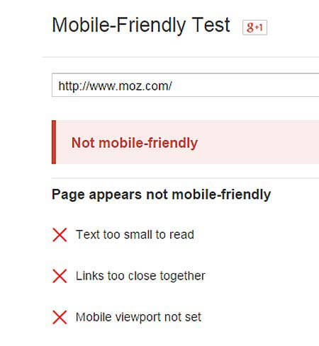
Google has created a specific application where you can test whether your blog or website is mobile-friendly or not.
It’s mobile-friendly test application is available here.
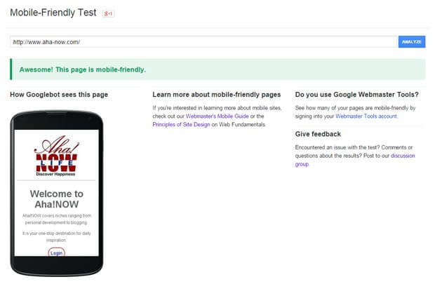
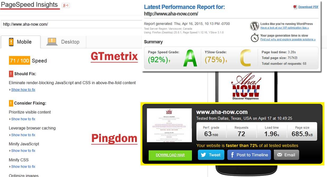
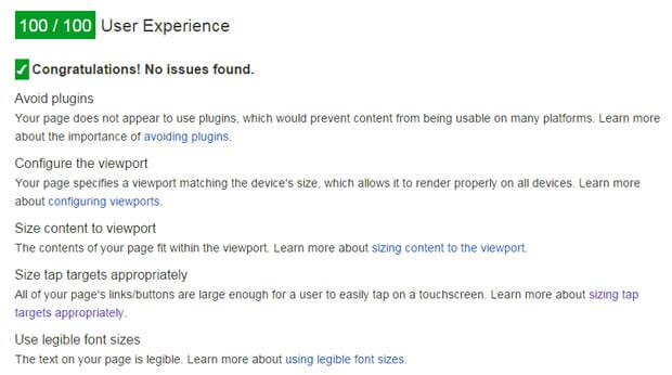
I tested Aha!NOW for its mobile-friendliness quotient and the result is below:

I even tested Aha!NOW for its speed and the results are satisfactory.
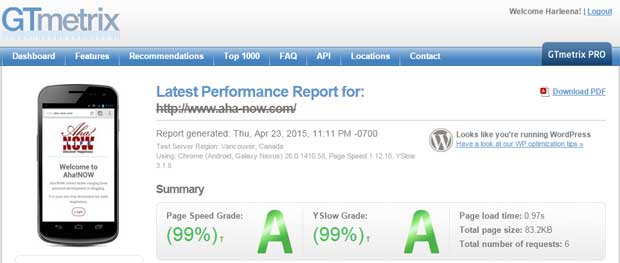

While GTmetrix also tests the loading time of your blog pages for mobiles, the Pingdom website speed test is for desktops and laptops.


We can presume that the mobile speed would be somewhat close to the desktop website speed.
Though these speed test results can be improved a bit, you really can’t do much, as there are always some external files that you have no control over.
What You Need To Really Look For And Do
I spent the last two weeks trying everything to make Aha!NOW get the best speed on all the website speed test sites.
I even tried to do the impossible – get full scores or the top grades!
This is what you do NOT need to do.
One, because it is not required to do so, two, it is not possible.
I took it up as a challenge only to retort to this suggestion:
“Get 100% user experience in the Google Mobile-Friendly Test and a site speed that is good enough for comfortable browsing.”
Google wants your site to open up under one second on all devices.
This may not always be possible unless you change the way you blog or use high-end facilities.
Though I got the Aha!NOW home page to open under one second.
Now you may say that it’s no surprise Aha!NOW got these speed results because its home page has been changed and re-designed. Did you see it?
That’s true, I’ve modified it into a light and simple landing page that gives an overview of the blog comprising of its features and services.
You too can do that with your blog or website.
Remember, the first impression really matters and having a homepage that loads fast will get you more pageviews and less bounce rate.
Well, there are certainly some pros and cons to this strategy and only time will be the best judge.
Let me know in your comments what you think of it.
Meanwhile, this is how Google PageSpeed assesses Aha!NOW’s mobile-friendly speed:
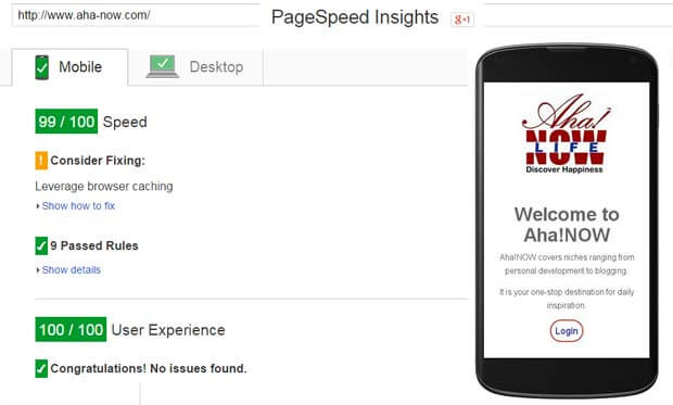

As I mentioned, these speed test results can always be improved but it may not be always possible to get perfect scores. (I got the score of 99 for once – just near perfection!)
However, we should understand that tackling Google Mobilegeddon is not about getting perfect speed scores, but creating a better user experience for the mobile visitors.
Remember, the speed results from these website speed testing sites may change with respect to device, location, and time.
[When testing your site for speed on different applications, always use the same testing location, browser, and other particulars.]More so, good speed numbers from these tests may not necessarily mean a faster site and a better browsing experience.
Sometimes the scores are fabulous but you experience a FOUT (Flash Of Unstyled Text), which leaves a bad taste with the visitors.
Therefore, after achieving a satisfactory score from the mobile-friendly tests, always take direct feedback from your site visitors – that is more valuable.
But you need to make your blog pass the mobile friendly tests else Google would not know that your website passes all the rules that makes it friendly for all mobile users.
The difference between Google’s Mobile-Friendly Test (MFT) and PageSpeed Insights (PSI) is that MFT uses Googlebot to fetch the page, while PSI tests the page as any human user would do.
Making Your Blog or Website Mobile Friendly
Let’s start the process of making your website mobile-friendly for Google.
The task of making your website friendly for mobiles does not require much technical knowledge or coding experience.
You should be able to make changes on your WordPress blog using the theme controls and features.
There will be some aspects that require technicality, but then you can always take some help from experts.
I have tried to make this guide as simple as possible so that non-techies like myself can use it as a DIY guide for making their website friendly for mobiles.
Our initial aim is to get the “Awesome! This page is mobile-friendly.” tag from Google.
After that, we need to work on to achieve 100% user experience.
Here are the steps you need to take:
This guide to making the blog or website mobile-friendly is based on my experiences with the implementations on my WordPress blog. Blogs based on other CMS or blogging applications may or may not completely benefit from this guide.
1) Test Your Blog or Website on the Google Mobile-Friendly Test
This test gives you the initial picture, the present standing of your blog, and the factors that you need to take care of.
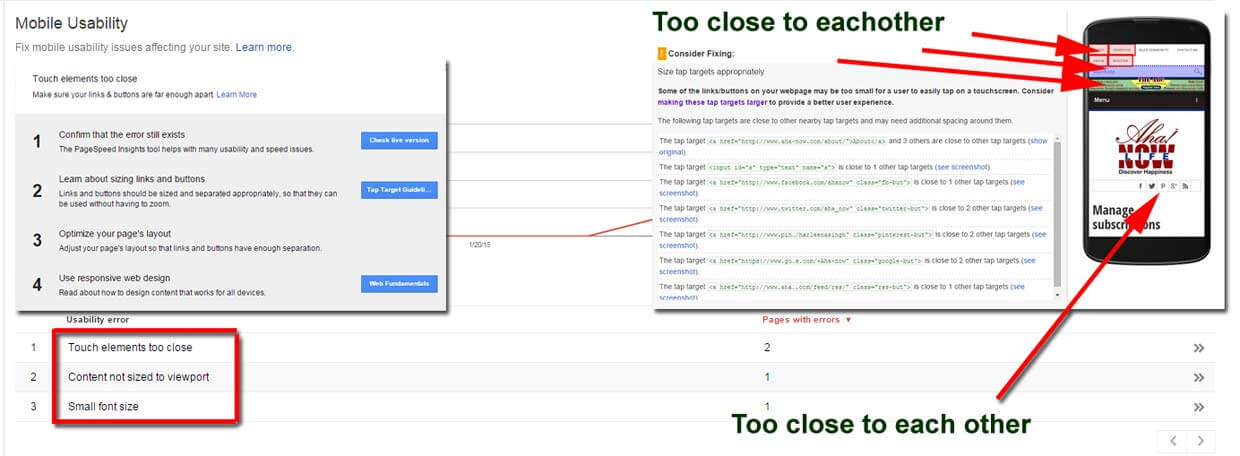
The MFT test result below shows the start point for Aha!NOW.
(Click/tap and spread to zoom)
As you can see, the Aha!NOW theme layout was flouting the basics of mobile-friendliness.
The touch elements were too close to each other, which made it difficult to use your finger to click on one of them without affecting the other elements.
Some of the website elements extended out of the mobile screen because their width was fixed on a size that was bigger than the width of the mobile screen.
The fonts used for links in the menu were too small and the viewers had to put in extra efforts and spend more time to read them.
2) Assess the Needs and Plan Your Strategy
Honestly, the task of making the blog Google mobile-friendly seemed difficult. My initial state was of confusion because I didn’t know where to start and what to do!
Things seemed to be bad and even the page speed for mobiles wasn’t good enough.
The speed statistics were not as disappointing as I had already converted the blog home page into a light landing page.
Meanwhile, I checked that there were others who fared worse than Aha!NOW.

If you too get a result like this when you test your blog or website for its mobile-friendly quotient, do not worry. You can clear the Google mobile-friendly test by implementing the following steps.
Remember that the mobile-friendly quotient is checked for every page and post on your blog. You can know which pages you need to work on from the information given in your Google webmaster tools account under the “mobile usability” option.
3) Get a Responsive Blog theme
Aha!NOW already has a responsive WordPress theme. This theme feature automatically took care to size the content to viewport of the mobile device.
Aha!NOW runs on a responsive theme from ThemeForest. As you can see, you don’t really have to spend much to make your blog mobile-friendly and speedy.
My ThemeForest theme has given me all the SEO and speed advantages. It is mobile-friendly because it is responsive.
If you are going to start blogging or create a new blog, look only for responsive themes because Google too recommends that.
Technical Step (!Important):
Check the source code of any of your theme page or post by clicking the right mouse button and selecting “View Page Source”.
Lookout for this line of code (meta viewport tag) at the top of the page or post:
<meta name=”viewport” content=”width=device-width, initial-scale=1.0″>
If you do not see it, then you need to put it in your theme’s “Header.php”.
While this code will size the content viewport on just any theme, you still need a responsive theme.
A responsive theme is better than the two other alternatives (dynamic and separate URLs) that Google suggests because you do not have to create separate pages or website for mobile audience, and the post URL as well as look of the bog too remain the same.
If you have never used your site’s cPanel or FTP, then leave this task of applying the code for an expert.
However, if you use a responsive theme, then this line of code will already be there on your website’s pages.
Additional resource: If you are technically inclined, you might like to read this Google resource on the fundamentals of a responsive design and make changes to your website accordingly.
4) Adjust the Blog Layout
After you sort out the mobile viewport issue, you need to tackle the “Text too small to read” and “Links too close together” issues.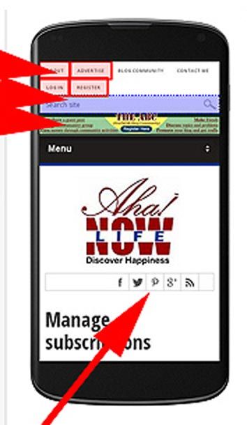
You saw in one of the image above that the menu links, search box, and the top header banner were too close to each other on Aha!NOW.
In such cases, all you need to do is tweak the design and layout of your blog.
I took care of this issue by removing the redundant links from the top menu because those links were also provided at the bottom of the blog.
I shifted the search box to a new location and got rid of the header banner. However, I can create a better location for the banner on the blog whenever I want to.
But for now, you got to do what is necessary to make your blog mobile friendly and pass the Google test.
I also removed the small social icons that I probably wouldn’t even be able to click with the tip of my little finger!
I see these on many blogs – if you do not want to remove them, make their size bigger.
Google recommends a minimum tap size of about 7mm or 48 CSS pixels with sufficient spacing between the buttons and links.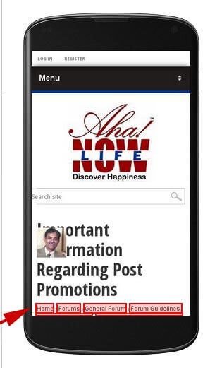
As I worked on my blog layout, after I resolved one issue, the MFT quickly presented me with another issue.
Since the mobile friendliness is inspected on per page basis, you might come to know of many issues that you never thought would have been cumbersome for the mobile users.
For example, I would never have sorted out my blog breadcrumbs if it wasn’t for the MFT results.
Similarly, I sorted out the footer links, the links in the “Post Promotion” widget of the ABC, and so on.
Finally, I also increased the font size of the blog content. I suggest choose your base font size as 16px or 18 px and line spacing of 1.625em or 26px.
5) Make the CSS, JS and Other Files Accessible to Googlebot
In order to render (show) your blog in a better way in the searches, Google wants to get access to the files that are responsible for the page rendering process.
These are mostly the CSS (Cascade Style Sheets) and JS (Java Script) files.
Google also wants to view your images and other theme related files before presenting your pages or posts in its search index.
You can achieve this objective by using a “Robots.txt” file.
This is a sample robots.txt file:

The search engines mostly honor the directives in this file and visit only the files that you want them to view. You can block certain files from the search engine bots.
In your Google mobile-friendly test, you were given a list of resources that were blocking the Googlebot.
All you need to do is “Allow” the Googlebot to access and crawl the specific files and folders.
You can create and implement a robots.txt file in two ways – by using the WP SEO by Yoast plugin or doing it manually.
a) Install the Yoast SEO plugin if you aren’t using it already. It will help you get access to your robots.txt and .htaccess files, create a sitemap of your website for search engines, take care of your RSS feed, and make your website SEO ready.
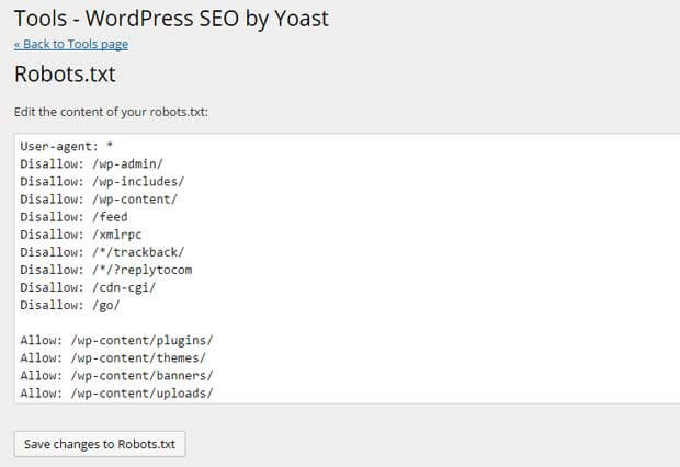

Navigate to SEO > Tools > File Editor and find your Robots.txt file. Fill it and save the changes.
b) Robots.txt is a simple text file. You can create one with the “Notepad” application on your computer.
You need to save it in the root folder of your website on your server. You can upload it through the cPanel or FTP.
Many webmasters do not know that WordPress already has a virtual robots.txt file, which is like the image shown below:
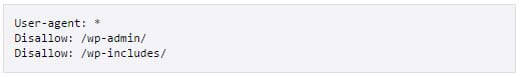

Actually, times have changed and more than blocking the files and folders, now you need to permit the bots to access them more.
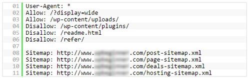
Look at the robots.txt file of Neil Patel’s personal blog.
User-agent: *
Disallow: /wp-admin/
That’s called simplicity.
In fact, you can view the robots.txt file of any website using your browser.
Here are some simple tips by Yoast on the how’s and why’s of robots.txt to make your website Google mobile friendly.
Voila! I hope you followed these steps and got 100% user experience tag for your blog or website.

Let’s push ourselves to do a bit more, to be in a position of advantage.
“The most common reason why a mobile page fails the Mobile-Friendly Test is that Googlebot for smartphones is blocked from crawling resources, like CSS and JavaScript, which are crucial for understanding the page’s mobile-friendliness.” ~ Google
6) Clear the Above-the-Fold Blog Area For Better Blog Speed
Speed is a key Google ranking factor. Google has indirectly mentioned that it will give preference in its mobile search index to websites that are fast.
“For extra credit, make sure that template is fast by checking the Speed section of PageSpeed Insights and making sure that the Speed section has no issues marked as “Should Fix.””
You need to follow the recommendations of the Google PageSpeed Insight results.
The first and foremost is to “Eliminate render-blocking JavaScript and CSS in above-the-fold content”.
The Google MFT result showed the files that were not giving access to Googlebot and the permission is given through Robots.txt. The Google PSI shows the files that appear before the initial crucial content and delay the display. You need special scripts or applications to shift these files from the above-the-fold area for faster initial display.
I had to spend some time researching for the best way to accomplish this objective, and the solution was very easy, which does not require any technical skill.
(Some may find it difficult, but if you go step-by-step – this is doable. I’m always here if you face any problems.) 🙂
I installed the W3 Total Cache plugin. This plugin, if used properly, can make your website fast.
W3TC can combine, minify, and defer the files so the clutter is reduced and all blockages are removed from the site render path.
We have a detailed post on Aha!NOW about how to use W3TC to load your blog faster. You’ll need to read it if you want to understand the following steps.
a) Goto “Performance” > “General Settings” and enable “Minify”. Next, goto the minify section and enable “JS”.
b) Select “Combine Only” and “Non-blocking using “async” as the Embed type. If this option breaks or disturbs your blog pages, try “Non-blocking using defer” or the “default (blocking)” options.
c) In the JS File Management section, choose your theme and fill in the render blocking script URL’s in the “File URI” fields.
d) Just copy and paste the Javascript URL’s shown in the Google PSI “Eliminate render-blocking JavaScript and CSS in above-the-fold content” section (You need to click on “show how to fix” to view them).
[Make sure that you copy and paste the files in the exact order it is shown on the PSI page – the order matters. You can always use the “Auto” option and use the W3TC “Help” to suggest you the files to minify.](To copy, hover over the file name, bring over the mouse on the file URL in a yellow box, highlight the portion you want to copy, and press Ctrl+C. You can ignore the URL portion before “/wp-content” and after “.js” in the file name.)
e) Choose the embed location as “Embed before </body>”. This will ensure that all javascripts that you filled-in will be combined in a single script and shifted in the footer area of your blog.
f) Save all settings. Remember that this is a sensitive procedure for your blog so you should always first backup your blog and its database. If your blog starts behaving strangely, simply disable “JS” or the W3TC plugin.
You need to repeat the process for the “CSS” section of W3TC. Choose “Enable” and “Combine only” (some do not choose the combine only option, but it works for me. So you should try and implement what works for you).
For @import handling, choose “Process” or “None”. Again, if one thing does not work for you, try the other. You can always “Google” for more information or ask a developer to help you.
You should fill in the CSS field URI in the same way you did in the “JS” section. Choose only the CSS files that the Google PSI tool result denotes as render-blocking.
You can read the earlier Aha!NOW post on how to use the W3TC to make your blog fast for more clarity.
Here is one tutorial that might help you, but in it CSS minify is used in place of CSS combine. In my case, the minify option broke my site.
After every step, re-check your site in the Google PageSpeed Insight tool. You will come to know what is working and what not. I’m sure the progress you see there will keep you motivated.
7) Minify CSS and JS Files
Your previous operation of clearing the above-the-fold area with the “minify” section of W3TC would remove many files from the list mentioned in the “Minify CSS” and “Minify JS” section of the Google PSI result.
For the remaining files, repeat the previous process of entering them in their respective JS and CSS sections as explained before.
There will be some external JS and CSS files too. No harm trying the same way with them too using their full URLs.
I found a better way to deal with these files. I used the “RocketScript” option of “CloudFlare”.
I use the free plan of CloudFlare and found that it nicely supplements the W3TC in making your website fast. W3TC has the necessary settings to help you operate CloudFlare through it.
Using the “RocketScript” option of CloudFlare is again sensitive for your blog – it may not support all the scripts that are in your blog.
In that case, you can use its manual option and disable RocketScript from the incompatible javascript files.
There will be a few files with the word “include” in their URl that will always remain in the “Minify JS” and “Minify CSS” sections of the Google PageSpeed Insights tool results.
These are the combined JS and CSS files created by W3TC. You should not try to minify them further. You can even open these files in the browser and you will find all your JS or CSS files in there.
This post will help you make your external scripts async, while this post is about making the javascripts defer.
“We must deliver and render the above the fold (ATF) content in under one second, which allows the user to begin interacting with the page as soon as possible.” ~ Google
Your tasks of making your website mobile-friendly end here. However, if you want to remain a step ahead of others, you should read the next step.
8) Use PageSpeed Module Filters
Mod_pagespeed are output filters that transforms the data before it is sent to the client and helps to speed up the site.
They can be operated through the .htaccess file or the server configuration files. Few hosting services provide this feature to their customers.
As Aha!NOW is hosted on Siteground, I’m lucky to have access to the mod_pagespeed filters that I can use through the website cPanel.
Ask your web hosting if they also provide you this facility, so you too can make use of it.
You can read more about the wonderful Mod_PageSpeed site speed enhancing feature here.
Though I’m pretty novice at it, I did enable some PageSpeed modules and that resulted in tremendous boost in the site speed.
Additional resources: Read this Google resource to know the mobile analysis in PageSpeed Insights and how it plans to help you make your website mobile friendly.
This article is only for the serious speed seekers and it is by none other than the man who heads Google’s PageSpeed team.
That’s it folks – I used a cheap WordPress responsive theme, free WordPress SEO by Yoast, free W3TC plugin, free plan of CloudFlare, and the bonus PageSpeed Module filters provided by Siteground to make my website not only mobile friendly but also fast, very fast!
More WordPress Resources To Make Your Website Mobile-Friendly
When you test your website for speed, you notice that two factors really bog your blog down – gravatar and images.
They both slow down your website, make it heavy, and prevent you from getting better speed scores.
As I like to experiment with things and ways to bring about positive changes on Aha!NOW, I use a few other resources that are as follows:
FV Gravatar Cache: This is a free WP plugin that I’m still trying out. It is supposed to cache the commenter’s gravatars locally to save time in fetching them from the Gravatar servers.
However, I still find the gravatars in the “Leverage Browser Caching” list of cacheable resources of the Google PageSpeed Insights results, so this is not working perfectly.
You can get this plugin here, try it, and share your experiences.
I’ve the option of disabling Gravatar on Aha!NOW and that would be a boost in the blog’s speed. Did you notice that Neil Patel and many probloggers do not use gravatars on their site?
EWWW Image Optimizer: Your blog images should be compressed. This plugin is a good tool to optimize your website’s images. It’s free, fabulous, and I think it performs better than WP Smush.
WP Smush: I also use the Smushit free plugin in conjunction with the EWWW Image Optimizer. They both work together smoothly and highly optimize the blog images.
WP Optimize: This free plugin cleans the website database. You need to optimize your blog database after every post you publish to keep your blog fast.
Ways To Deal With The Google Mobile Friendly Test Suggestions
There is more to making your website mobile-friendly.
The Google MFT test will further suggest you to resolve the “Prioritize visible content” and “Eliminate render-blocking JavaScript and CSS in above-the-fold content” issues.
I’d like to share some of my experiences with the problems that I faced.
Dealing with Google Fonts
One of the scripts that the Google’s PageSpeed Insights results suggest to defer or remove is the “fonts.googleapis.com” or the “Open Sans” font script.
Most WordPress themes use the free Google fonts – not only in the WordPress admin dashboard but even in your website pages and posts.
As long as you use Google fonts on your blog, these site speed testing sites will mark the Google font script as one of the factors that slows your site.
Check out this resource. By the process mentioned in it, I do not get the Google font as one of the render blocking script.
Caching Third Party Files
There will be many scripts that you may want to either minify or make them cachable in web browsers but you cannot because they are third party scripts and you have no control over them.
One solution is to save them on your computer, upload on your server, and give the locally hosted file reference in the CSS or JS code, wherever the third party script file is referenced.
I experimented with a few social media scripts and was able to remove them from the Google PSI results.
However, the drawback is that you need to keep updating these copied files with the original scripts on a regular basis.
The same thing you can do with the Google Analytics script. Here is a resource that shows exactly how to copy it and create a cron so that the script is automatically updated regularly.
Combined And Minified Files
Though W3TC, CloudFlare, and Mod_Pagespeed help to reduce and remove the many render blocking CSS and JS files, they leave one of their own files in the crucial above-the-fold render blocking area.
I do not know what you can do with the files that CloudFlare and Mod_Pagespeed leave behind, but you can move the W3TC combined and minified files out of the render blocking area, to a location of your preference.
Use these codes in your footer.php iles, just above the </body> tag.
<!– W3TC-include-css –>
(Used with “Auto” and “Manual”. Inserts the minified/combined CSS files at the location you choose.)
<!– W3TC-include-js-head –>
(Used with “Auto” and “Manual”. Inserts the minified/combined JS files. Embed location “in <head>” in “Manual” mode.)
<!– W3TC-include-js-body-start –>
(Used with “Manual”. Inserts the minified/combined JS files. Embed location “after <body>” in “Manual” mode.)
<!– W3TC-include-js-body-end –>
(Used with “Manual”. Inserts the minified/combined JS files. Embed location “before </body>” in “Manual” mode.)
Make sure that you embed the CSS files above/before the JS files location.
Getting Rid Of FOUT
I mentioned “Flash Of Unstyled Text” (FOUT) before. This is a situation when either you see a blank page or the page text appears without any formatting or style.
It is due to the immediate unavailability of the critical CSS files to render the above-the-fold area.
To resolve this issue, you should “inline” the critical CSS. You can do that by copy and pasting it in the header.php of your WordPress theme. Do not forget to use the opening and closing style tags.
I hope these suggestions help you improve your blog for better user experience of your mobile site visitors.
However, even after putting in lot of time and efforts, I was not able to resolve these Google PageSpeed Test suggestions completely:
Leverage browser caching – There are always some files like the social media and Google Analytics scripts that the browser cannot cache.
Reduce server response time – You can try but eventually it depends on your web hosting.
Minify CSS and JavaScript – You cannot and should not re-minify the already combined and minified files.
Optimize images – Some images, mostly the gravatars, cannot be optimized.
There is one way you can remove these “fix” suggestions of Google PSI Test – do not use gravatar, use high-end web hosting, do not use social media and Google Analytics, and plugins that add CSS and JS files.
In short, you cannot achieve perfect Google PSI and other site speed testing scores because you need all most of these things to provide better experience and facilities to the blog viewers.
Do’s and Don’ts For Mobile Friendly Websites
There are somethings that you should always do and some that you should never implement on your website.
Here is a brief outline of the do’s and don’ts that will help you make a mobile friendly website:
DO’S
- Use CSS width expressions in percentage (100%) instead of pixels.
Thus you make the width relative to the screen size instead of keeping it fixed in size, else your site content may fall out of the viewport for some mobile devices.
- Use retina images on your blog if your theme supports it. This helps the mobile viewers zoom in and make the image larger. Check out a few retina images on this post.
- Use <iframe> embeds to make your YouTube videos mobile-friendly.
DON’TS
- Don’t use Flash on your website for mobile viewers unless it has HTML5 embed tag or code snippet.
- Try not to create a separate website for mobiles like m.yourwebsite.com. Responsive themes are best for blogs.
- Don’t use interstitial as they block the user from completing tasks. Instead use HTML banners.
Further, Google is telling you NOT to make these common mistakes if you want a website that is mobile-friendly.
Here is all about mobile-friendly websites that Google wants you to know. If you are not aware of or up-to-date with the mobile-friendliness and mobilegeddon buzz, then read this straight from the horse’s mouth.
Here is an excerpt from that article and I’m sure you would be interested in it:
Question – Unfortunately, my mobile-friendly pages won’t be ready until after April 21st. How long before they can be considered mobile-friendly in ranking?
Answer – We determine whether a page is mobile-friendly every time it’s crawled and indexed — you don’t have to wait for another update.
Once a page is mobile-friendly, you can wait for Googlebot for smartphones to naturally (re-)crawl and index the page or you can expedite processing by using Fetch as Google with Submit to Index in Webmaster Tools.
For a large volume of URLs, consider submitting a sitemap. In the sitemap, if your mobile content uses pre-existing URLs (such as with Responsive Web Design or dynamic serving), also include the lastmod tag.
Recapping: What You Need To Do To Make Your Website Mobile Friendly
If you want your website to get ranked in Google’s mobile search index, then keep in mind the following points:
- Use a responsive theme for your website (preferably).
- Make sure every page of your website has the meta viewport tag.
- Adjust the site layout, including the tap targets and font size.
- Make your website fully crawlable by the Googlebots.
- Make the above-the-fold area non-blocking.
- Inline, defer, or async the scripts and stylesheets as per the need.
- Optimize the images and use proper CSS that promote responsiveness.
- Resolve the crawl errors in your Google Webmasters Tools account.
Finally, this is a very helpful resource website that you should visit to make your website better and mobile-friendly.
There is a lot more you can do that requires coding and technical expertise. But this post deals with all what we can do as non-technical bloggers and webmasters.
Also do read these five steps to a mobile-friendly website by Google.
However, I need to add a disclaimer here – I’m a non-technical blogger and I’ve written about my personal experiences and best information that I gathered on the Internet. Though most of the information would help you, I would appreciate if you share your technical opinion and suggestions.
Things that worked for me might not work for you. So, kindly use your discretion and do not hesitate to take a developer’s help if you are in doubt or do not completely understand the process that I have explained in this post. Thanks.
So, what are you waiting for? If you haven’t made your website mobile friendly for Google yet, then make use of this week.
If you have any questions after reading this post, then shoot them in the comments or join the discussion with other blogging and WordPress experts in the community forum.
We also offer services to help you speed-up your blog and make it mobile-friendly. If interested, contact here.
Over To You –
Is your website prepared to face the Google Mobilegeddon? How did you make your website mobile friendly? What is your take away from this post? What more should bloggers and webmasters do? Please share in the comments.