Understanding Basic Typography Designing Rules

Table of Contents
One of the important elements of design is typography. It deals with the aspects of font face and typeface and their layout in a given space. There are certain rules in the application of the art of typography. Here’s all the basic information you need to understand the typography designing rules. ~ Ed.
Typography is not just about making words easy to read. It is considered an art for arranging type within the layout, which includes the management of the color scheme, grid, and other techniques to form a professional design.
There are basic things to consider in applying the art of typography for your design. As a designer, you need to know the basics so you can deliver and convey the idea presented by your clients.
It will also provide an arena for you to be more creative and improve the quality of your work.
6 Basic Typography Designing Rules
You need to consider the aspects of the font faces and their number, size, and color as well as several other aspects of your professional design. Here’s the basic information for a better understanding of the use of typography in design.
Font Face and Typeface
Knowing what font face to use is the primary step since each font-face is unique with its measurements, central specifications, and distinct vocabulary.
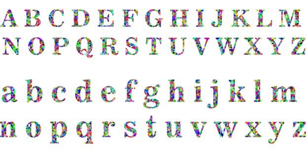
Not to be confused with typeface, the font face describes the weights, widths, and styles that form a typeface while the typeface refers to the family of the font face.
It is imperative to exert time and effort in knowing several font faces and understanding each of them. With ample knowledge, you will be able to specify what particular font face will be better and its advantages over other fonts.
There are also font faces that are applicable depending on the message to be conveyed or the design’s purpose.
An article mentioned that there is a psychology behind the font used in logo design. It declares that Serif font carries class and heritage, slab serif shows solidity, and that Sans serif is modern and engaging.

Standard Fonts
Use standard fonts if you are just beginning to understand the concept of typography. Safe web fonts include Arial, Helvetica, Times New Roman and Courier New. Otherwise, feel free to try various fonts and get creative with these best free fonts out there.
If you want to stick to standard fonts, opt for the Open Sans font because most users are familiar with this font which leads to them reading the content faster. You can deviate from this rule if the website you are designing is meant for marketing brands or intends to reach an immersive experience for your client’s target audience.
Nevertheless, it is best to use the underlying system fonts such as Arial, Calibri, and Trebuchet. If you are designing a website, you can find several font embedding services such as Google Web Fonts or Typekit to make a fresh website.
Number of Font Face
Do not use more than three different fonts because numerous font types and font styles will result in unstructured and unprofessional designs. It is best to know which font would complement another.
For instance, combining Georgia and Verdana creates a harmonious pairing because both share similar width values; on the other hand, combining Baskerville and Impact will make the latter font overshadow the former.
Letter Spacing
It would be best if you learned the value of Kerning, the process of adjusting the space between characters for creating a tuneful pairing.
One basic example is the spacing between the letters ‘A’ and ‘V’ when both are in uppercase. The diagonal strokes of the letters are usually kerned wherein the top left of the ‘V’ sits above the bottom right of the ‘A’ to create a more pleasing appearance.
Although a uniform space is usually automatically applied by the system between these letters, leaving the spacing unchanged may seem off. For some designers, this may not be important, but learning correct kerning procedures ensures that the space between each character is aesthetically even to create a systematic text.
Kerning is primarily suitable for headlines or logos because it can easily ruin the whole design, unlike in long sentences or paragraphs wherein kerning is often subtle. In relation to kerning, you must also learn the importance of tracking, which refers to the system of adjusting the spacing of all characters in a word for a balanced design.
Font Size and Dimension
To better guide readers, font size can help define the hierarchy and emphasis. The headings are usually large, sub-headings are smaller than the headings’ size, and body text is smallest in the range.
Additionally, ensure that the x-height and set width of the fonts you are using are similar. The x-height in typography defines the height difference of lowercase with uppercase letters while the set width refers to the width of the letter.
Color
A font’s color should be used wisely. You must learn the concepts of color theory to make sure that your font colors will be too much of a distraction or might be confusing to readers.
You can even use the psychology of color in creating the best typographical design.
Wrapping It Up
Typography designing may seem like a daunting pursuit, especially for those with little artistic skills. However, you can ensure that your work will be readable and aesthetically pleasing if you keep these basic typography designing rules in mind.
Knowing the typeface and fonts’ characteristics will aid in combining them in designs. Although standard fonts are your safest bet, you can always combine up to three different font faces with similar dimensions.
Moreover, you can use font sizes, colors and even spacing for emphasis and hierarchy. Just remember that good typography intends to attract the attention of users to the content and not to the type itself.
Over to you
How do you use typography when you design your website or any professional design? Share your tips and rules in the comments.
Disclaimer: Though the views expressed are of the author’s own, this article has been checked for its authenticity of information and resource links provided for a better and deeper understanding of the subject matter. However, you're suggested to make your diligent research and consult subject experts to decide what is best for you. If you spot any factual errors, spelling, or grammatical mistakes in the article, please report at [email protected]. Thanks.


I do accept that typography is an art rather than a technique. I always encourage my bloggers to learn typography design rules. This helps to make the website content readable. I suggest the use of not too many fonts faces in our blogs. I feel using different fonts can distract the readers.
I would like to add one extra thought that the focus of any typography should be on the readability of the end-user some time it looks good but very difficult to read.
Best Of Luck Emily.
Hi Emily,
I would like to add one extra thought that focus of any typography should be on readibilty of end user some time it looks good but very difficult to read.
Best Of Luck Emily.
Adarsh
Great Informative post on 6 designing rules an that too on typography, with different fonts, color, Number, and spacing explained in detail.